

 422
422 0
0The Best Color Solutions for a Harmonious Small Kitchen
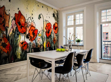
Art & Photo Prints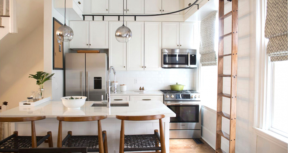
Food is not only prepared in the kitchen, but also consumed, and since it is scientifically proven that the environment can affect digestion, it is very important to choose a suitable palette of colors for this room. Since the limited space dictates its own laws, color schemes for a small kitchen play a very important role. Let's take a quick look on the best color solutions for the small kitchens that will help you visually expand space without sacrificing functionality.
Design Techniques for a Small Kitchen
The issue of small kitchens is very relevant anywhere in the world, and especially in large cities such as New York. There is no place to turn around a kitchen like that, but it can be made attractive and comfortable.
The whole complexity of small kitchen design lies in the need to combine the aesthetics of the interior with the functionality of the space. This somewhat restricts the actions and forces one to nevertheless make a choice in favor of practicality.

However, thanks to certain design techniques, this problem can be solved quite competently. The main role here is given to the basic background for decor, which is the coating of walls, ceiling and floor, the palette of which should be the main one.
Kitchen sets, household appliances and other accessories are only complementary accents. The specifics of the choice depend on such factors as the configuration of the room, natural light and furniture layout.
The most important thing while determining the style of a limited space and choosing color options for small kitchens is to avoid making them visually even smaller.
Background Color
In this case, it is not difficult to choose the main color; you need to strive for bright colors, since they are the ones that can visually increase the space of the room. Dark shades are used only as a contrast, which does not occupy a large area.

For example, a graphite tabletop and a backsplash on the working wall, or the facades of the headset, can stand out beautifully against the background of walls and a cream-colored headset. Contrasts are possible, but should be applied in dosage.
You can choose not only the traditional snow-white out of the light colors - white has more than a dozen shades that are perfect for decorating the walls of the kitchen: ivory, linen, smoky, beige, biscuit. You can also use the highly whitened tonal colors of the solar spectrum: bluish, pale cornflower blue, turquoise pastel, thistle.
This does not mean at all that the entire kitchen from floor to ceiling should be in bright colors - just make up two-thirds of the interior (preferably the upper part), and you can select almost any additions and accents in terms of color intensity.

Since the headset is located at the top of the wall and at the bottom, it is better if its upper facades duplicate the color of the walls. From the bottom, they can be dark or bright - for example, in the color of the floor covering or a backsplash on the wall.
Additions and Accents
Many people avoid white color in the kitchen because it does not hide stains on the surface. Although modern materials have a quality that often does not allow them to get dirty, or, as an option, makes them easy to wash, for example super easy washing wallpapers or glossy panels, or silicone water-dispersion paints.
So, boldly apply light shades, and to add cheerfulness to the interior, combine them with richly bright or contrasting dark tones.

For example, ocher, the majority of shades of wood, goes well with white, linen or beige. They add color, making the interior dynamic, but leaving it light.
You can combine several colors, including adding red, orange or bright yellow. These colors, by the way, improve the appetite, so they are actively used in the manufacture of kitchen sets. Alternatively, this color can be used for a ceramic backsplash along the working wall.
If saturated shades are applied over the entire height of the room, and even if the background is not made light enough, the interior will no longer be cheerful, but overloaded. In addition, the smaller the room, the stronger the lack of space will be felt in it. It is enough if only the tabletop or dining table is dark.

Dark - does not always mean coal-dark. The color may not be black, but very deep blue, burgundy or gray. Some of them: ash, marengo, wet asphalt, are just perfect for the kitchen. Depending on the saturation, they can be used not only for contrast, but also as the main background.
In the kitchen, shades of wood range always look good, in which only dark or only light should not prevail. They combine perfectly with each other, with gray tones and bright accents. This mainly concerns walls and furniture facades; the color of the floor does not have much significance because of its small area.
The ceiling is traditionally made white or painted in the color of the walls. It can be dark or even black - but only if the height of the room allows. Moreover, the color of the chosen stretch fabric, for example, should be duplicated in the floor pattern or at least on one wall.

Green and Yellow Colors
Add dynamism to the interior by using warm colors. Cold shades pacify, bring peace. However, these are too general characteristics - each color has its own energy.
Green, for example - although not all shades, gives a sense of balance, calms, makes a positive note. The most promising transitional yellow-green shades: mustard, olive.
Uplifting yellow color invigorates, filling the room with the sun. This is one of the three primary colors that cannot be obtained by mixing, so it goes well with most others: gray, blue, orange, silver, even red. The most important thing is to choose the right shade.

Using and Balancing Red Color
Red excites the nervous system, and if it is used in excess is becomes annoying. Therefore, it must be used very carefully.
With the right approach to combining, this color will very much enliven the picture, especially since it is not necessary to use scarlet shade. Red has 25 shades: salmon, terracotta, wine, coral and others, from which it is quite possible to choose an interesting option.
The blue color is no less diverse, which, incidentally, perfectly balances the aggression of red. Together, especially when a desaturated blue is involved in the combination, they make up a wonderful tandem.

In Conclusion
Even when colors blend well theoretically, you might get a bad result in the real interior. To prevent this from happening, you need to remember a few rules, while choosing shades:
- Do not try to invent a “bicycle”, but take schemes proven for centuries
- Try to create the right background, which should be at least 60% in the interior.
- Be sure to consider the orientation of the windows to the cardinal points - for the south and west-looking windows it is better to use cold shades
- If furniture for the kitchen was purchased before the start of the repair, take its tint palette as the basis
- The color scheme depends on the style, and not on the fashion
Given the small area of the kitchen, use mostly light shades, but do not forget about the accents that bring revitalization to the interior.
 Noble Silver in the Interior Décor
 Marine-Style Interior of Your Dreams
 Tips on Creating the Perfect Home Office
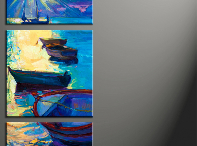
 Adding Style to Your Home with Multi-Panel Canvas Sets
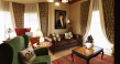 Elegance of English-Style Interior Decor
 The Best Color Solutions for a Harmonious Small Kitchen
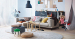 Practical and Comfortable Ikea-style Interior
 Tips on Creation of Fusion Style in the Interior Decor
 Interior Accomplished in Neoclassical Style


